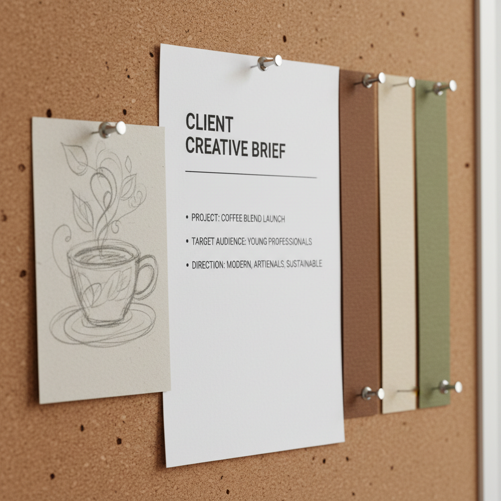
The Brief
CLIENT: Maison Lefèvre
BRIEF: Logotype for a new fragrance house.
FEELING: Quiet luxury, old-world craft,
the weight of a wax seal.
REFERENCE: Reject all existing fonts.
DEADLINE: 3 weeks
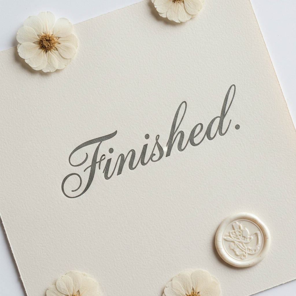
The Finished Work
Maison Lefèvre
Pointed nib · Sumi ink · 300gsm cotton
Drag to reveal
Scroll
Luxury Logotype · Maison Lefèvre
The logotype
no font file
could give them.
The Problem
Six rounds of type-set proposals. Every leading font house tried. None carried the weight of a wax seal. The brief said: reject all existing fonts.
The Brief
"We need a mark that feels like it was written by someone who has been writing for a hundred years."
— Isabelle Moreau, Creative Director
6
Rounds
23
Fonts rejected
3
Weeks
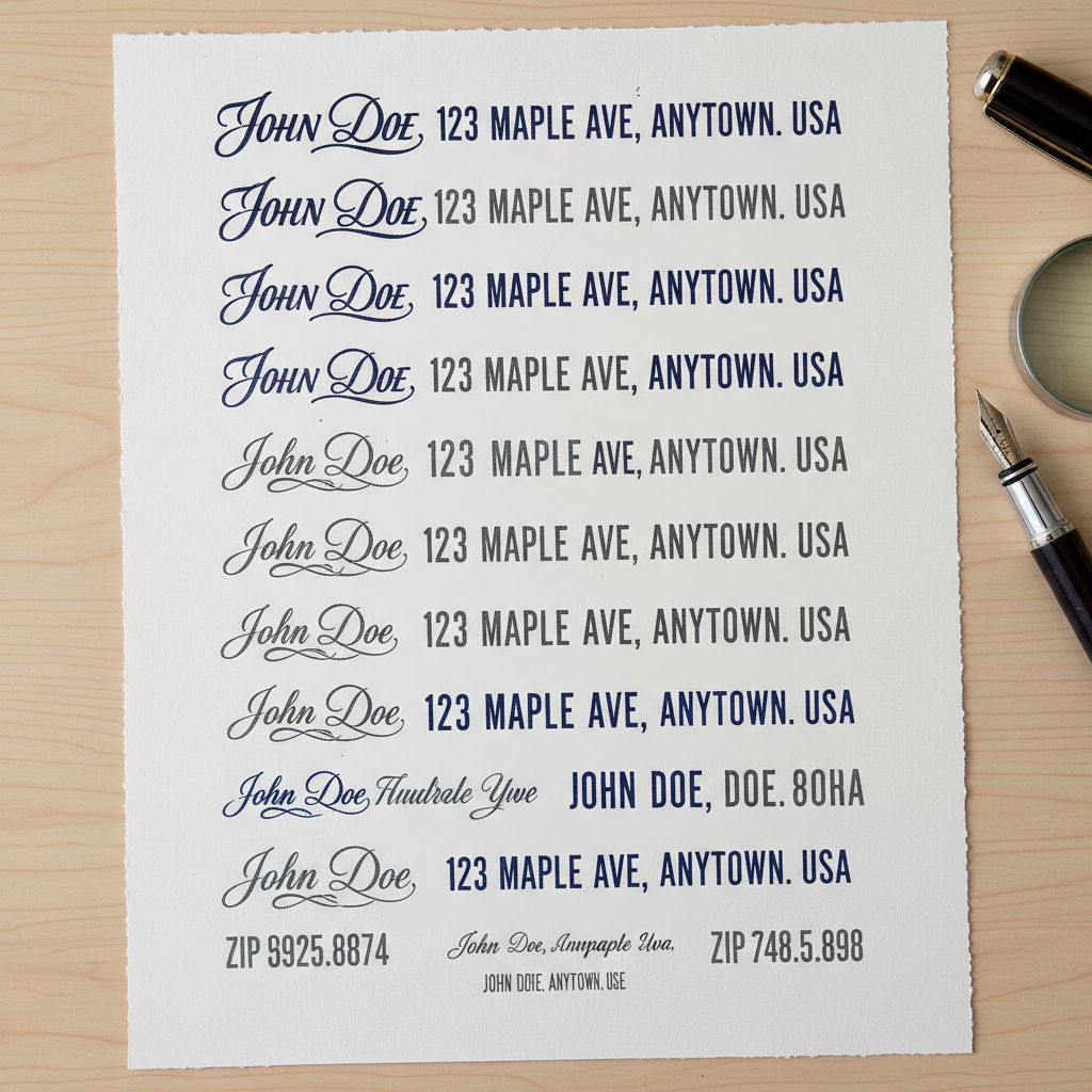
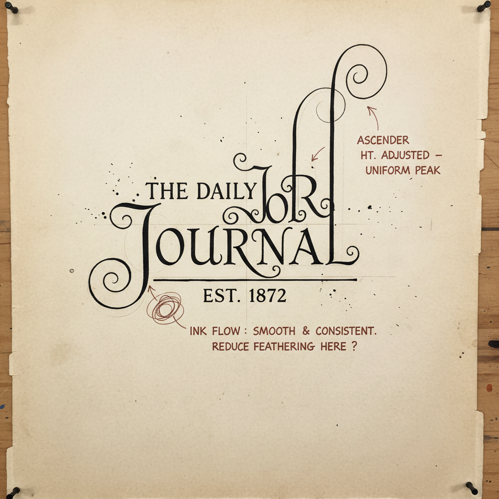
The Process
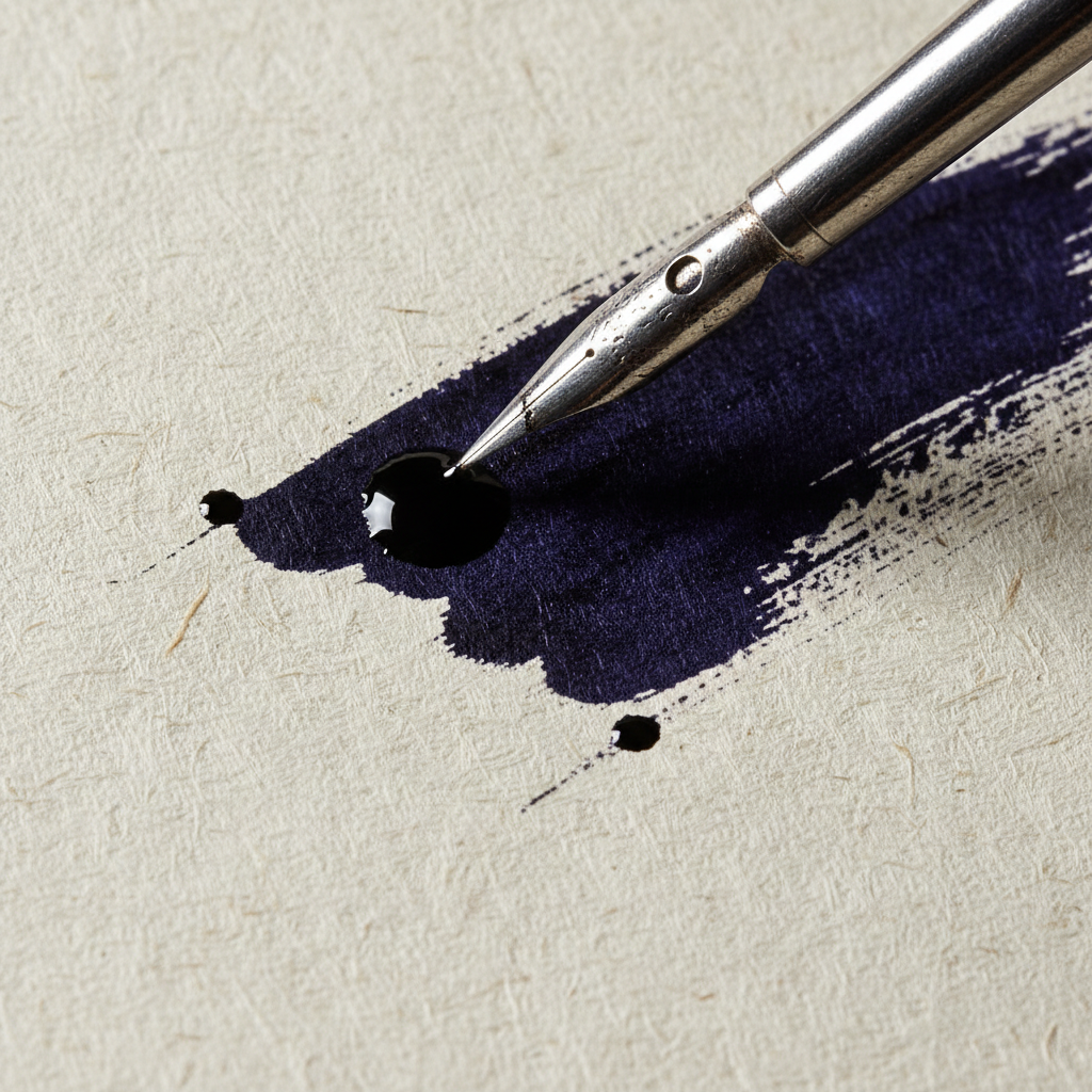
Nib study · Nikko G
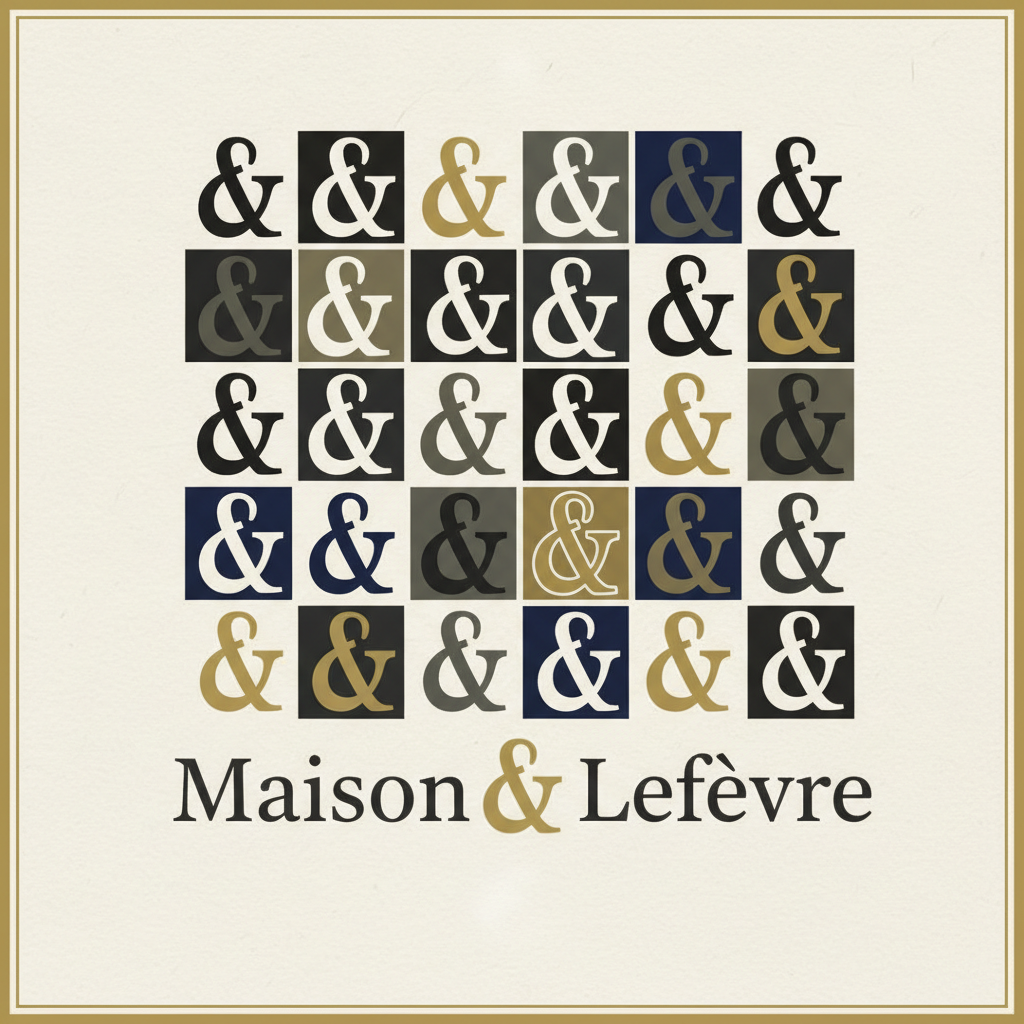
30 ampersand studies
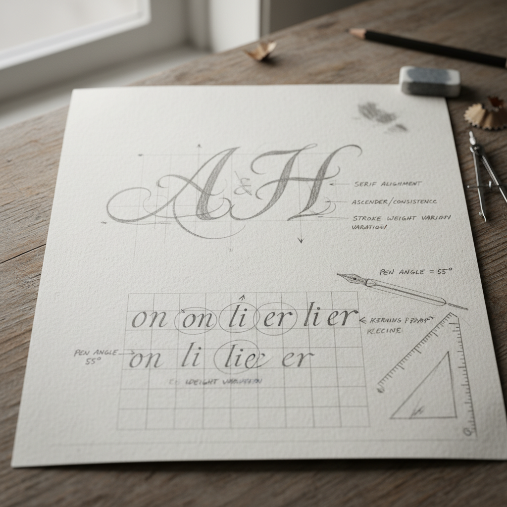
Annotated sketches
Final ink pull
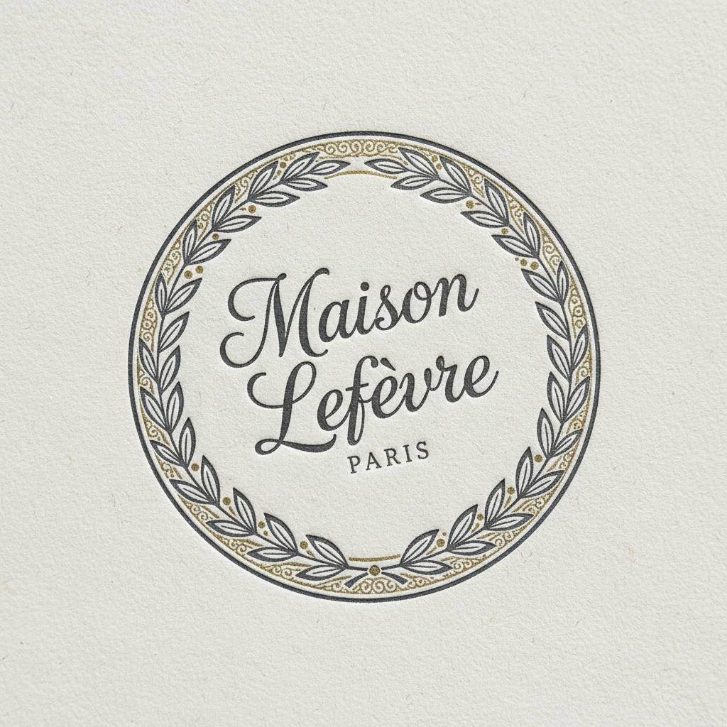
Maison Lefèvre
Pointed nib · Sumi ink · 300gsm Crane & Co. cotton · Letterpress printed
Delivered
Feb 2026
Have a brief like this?
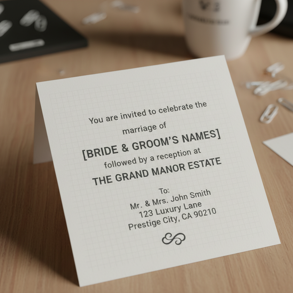
Wedding Invitation Suite · Harrington–Delacroix
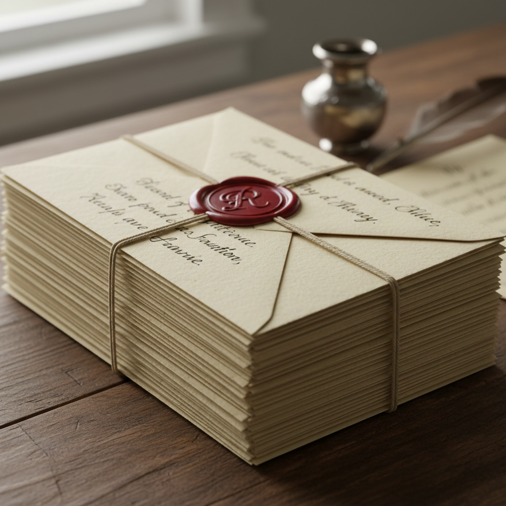
340 envelopes,
one hand,
no two alike.
The Problem
The printer's digital addressing looked like a utility bill. Three hundred guests at a venue that had hosted royalty. The planner called on a Tuesday. The wedding was in six weeks.
"Every guest should feel the envelope was written for them alone. That's the only brief I have."
— Charlotte Voss, Wedding Planner
340
Envelopes
110lb
Paper stock
6
Weeks
4
Ink pots
The Process
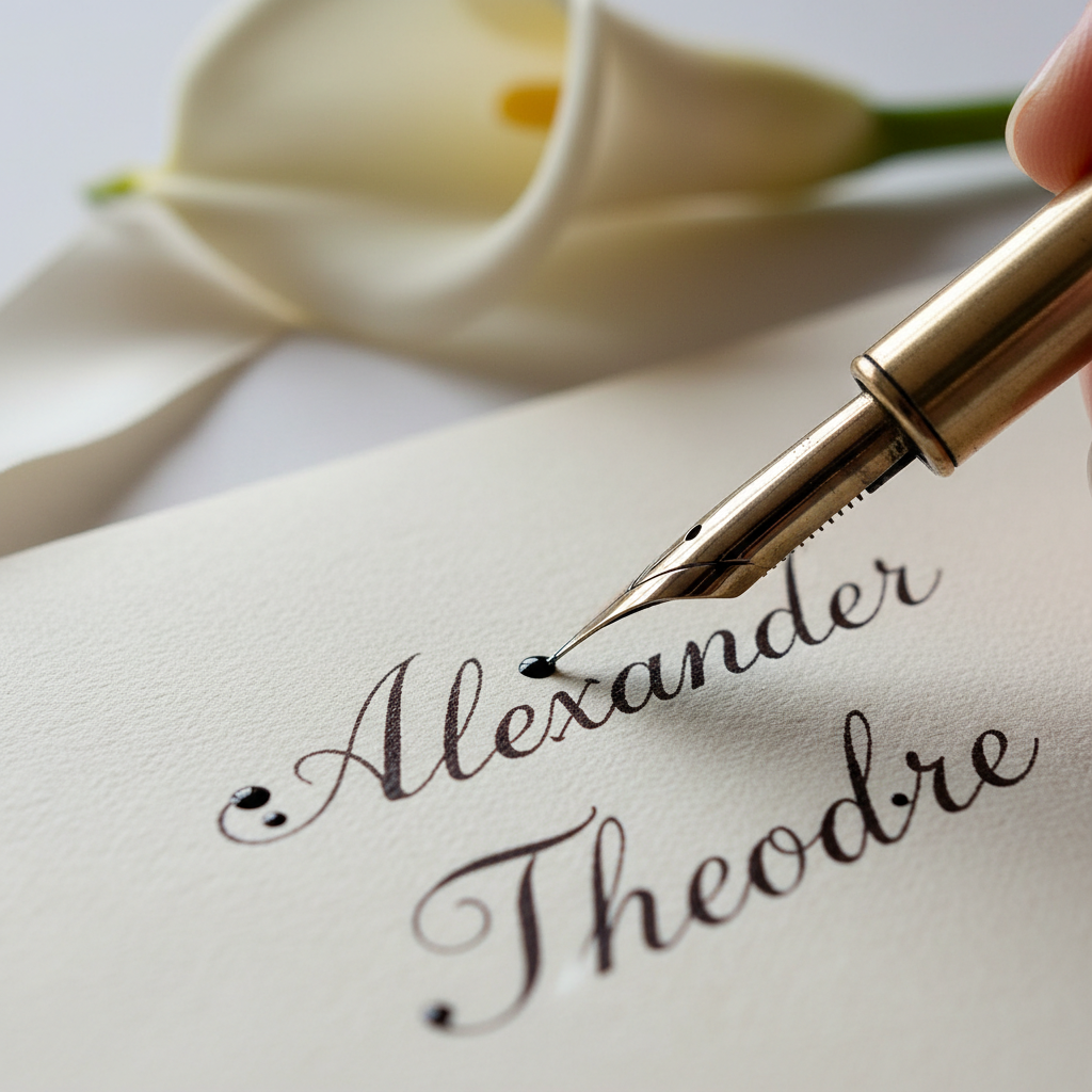
Nib addressing session
Copperplate script
Paper test · Crane & Co.
110lb cotton
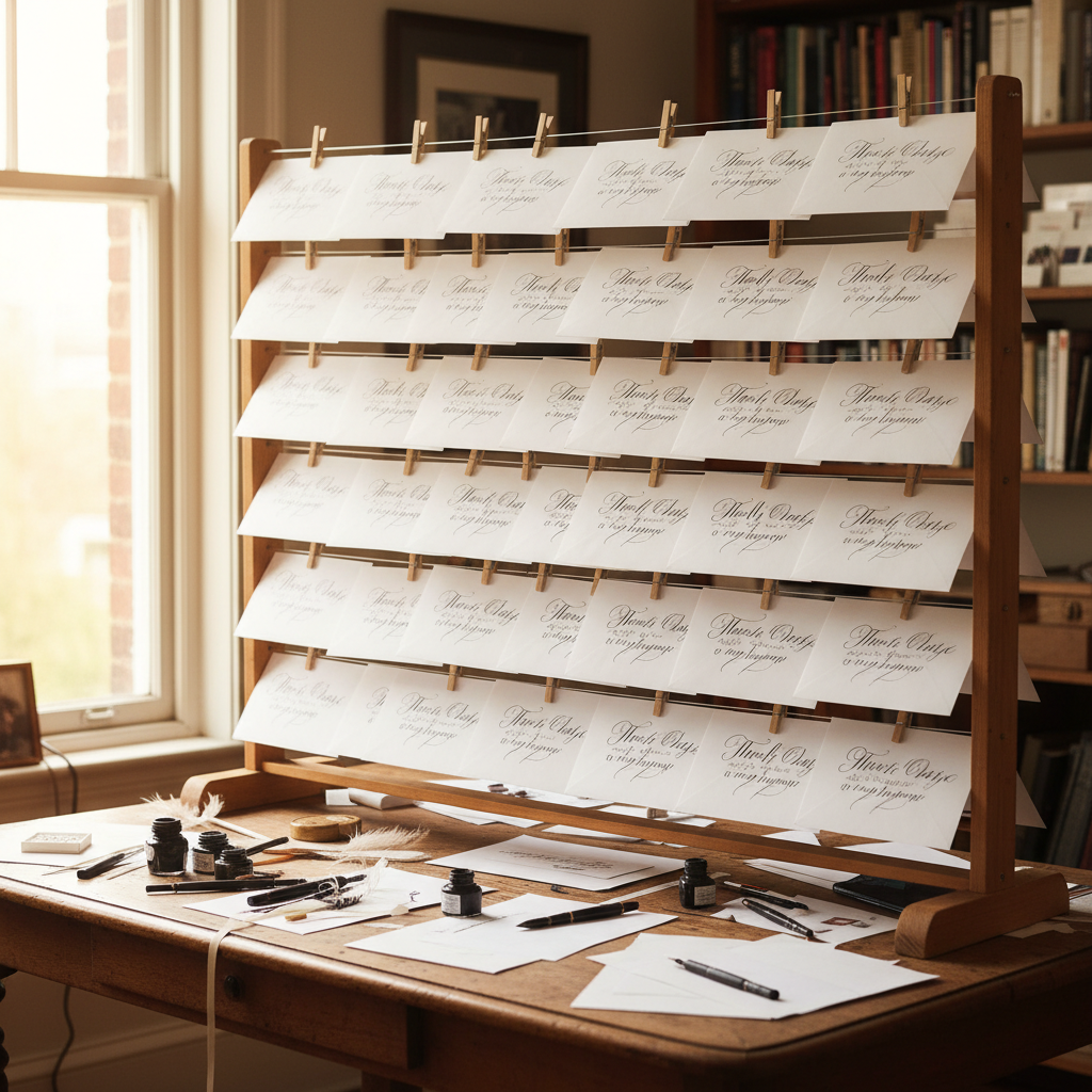
Drying rack · Day 8
42 envelopes/day
Final stack
Ready to post
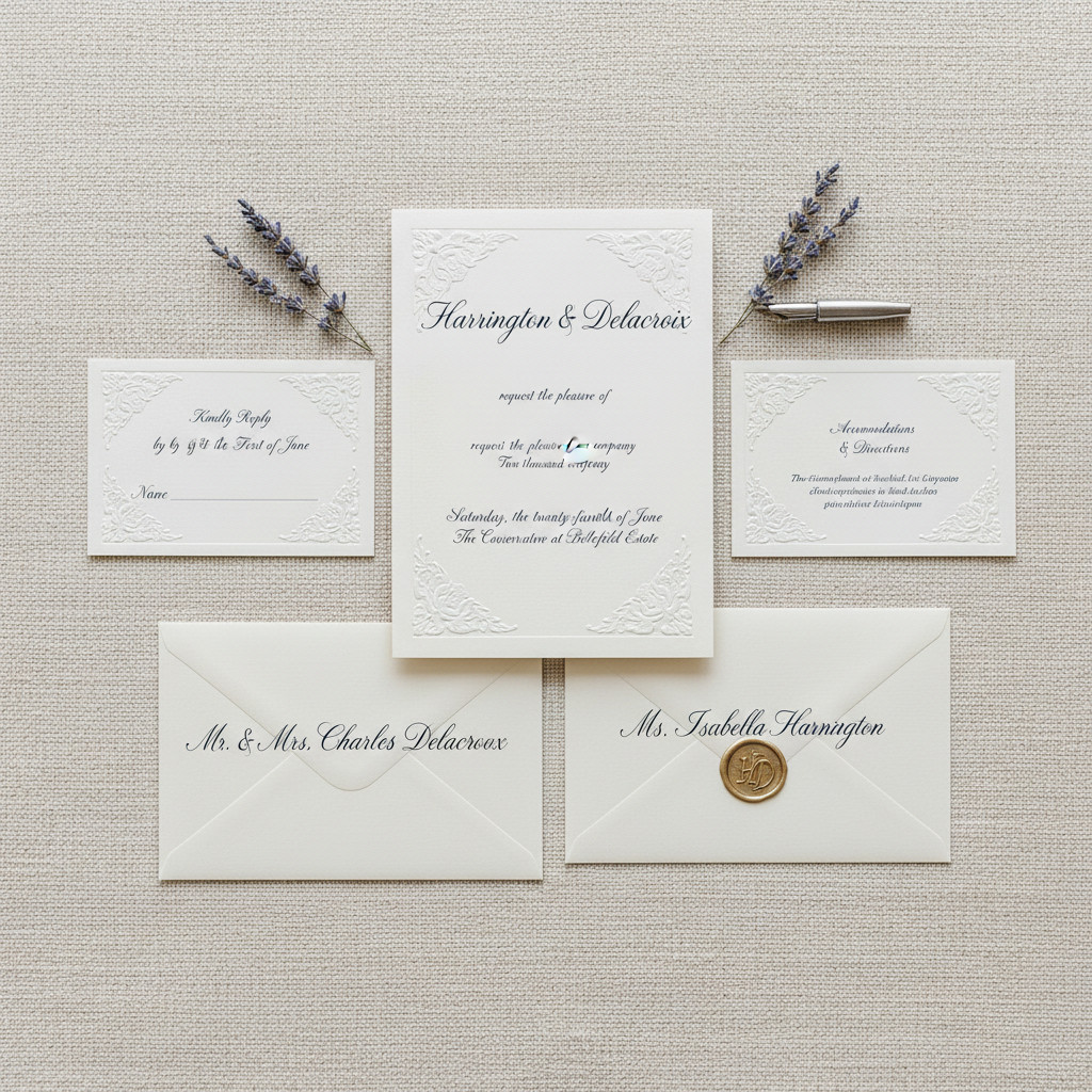
Harrington–Delacroix
Copperplate script · Walnut ink · Crane & Co. 110lb cotton · 340 hand-addressed pieces
Planning a reception that deserves this?
Editorial Masthead · Éclat Magazine
A masthead
that earns
the newsstand.
The Problem

"Every luxury magazine uses the same four typefaces. We wanted something that couldn't be downloaded."
— Théo Marchand, Art Director, Éclat
The Sketches
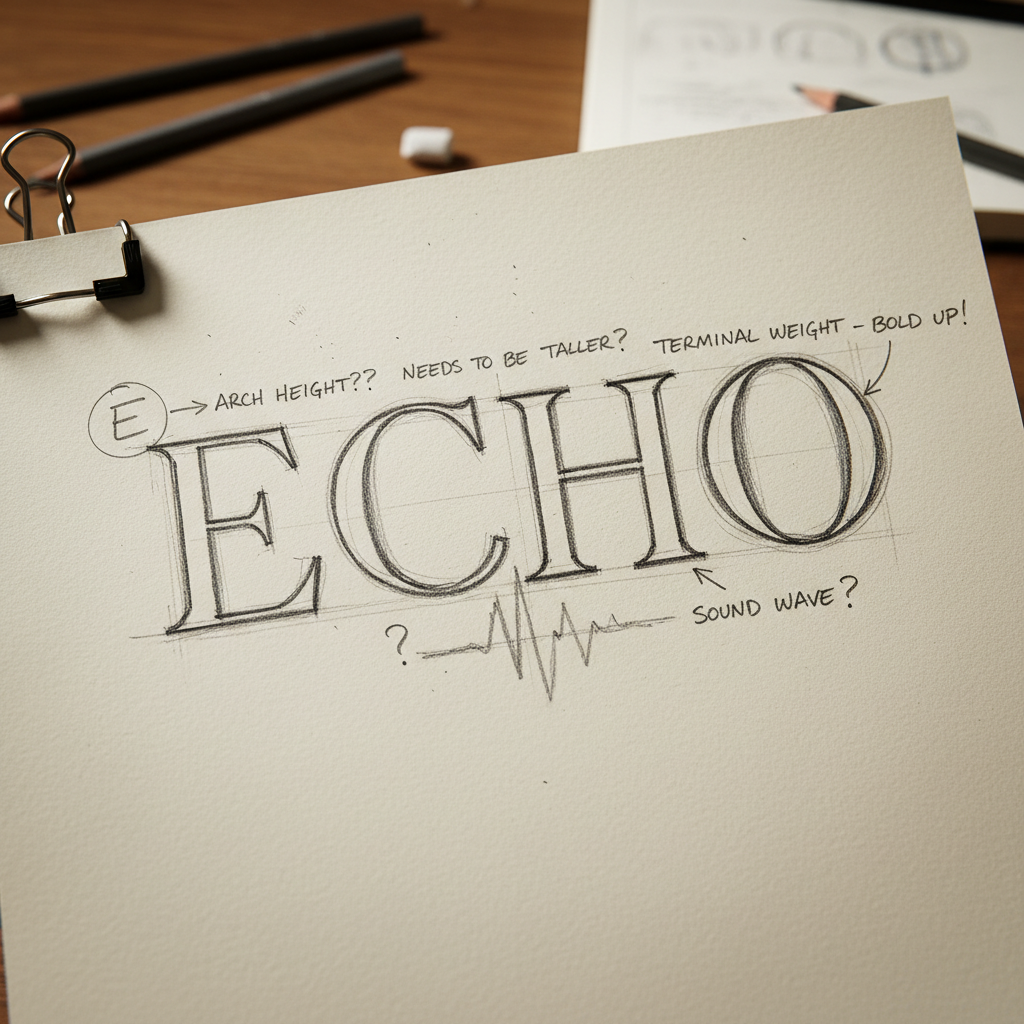
Rev. 01 — "É too upright"
Rev. 03 — "closer, soften É"
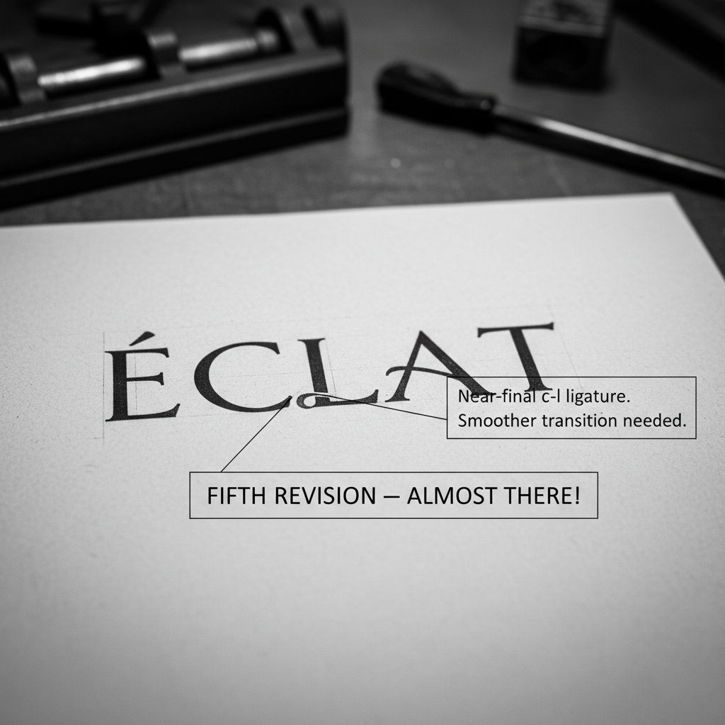
Rev. 05 — "c–t ligature works"
Rev. 06 — approved
Instrument
Leonardt Copperplate No. 1
Finest nib for hairline precision at masthead scale
Ink
Carbon black + 3% gum arabic
Archival density for reproduction at newsstand scale
Revisions
6
Over 4 weeks, 3 in-person reviews with art director
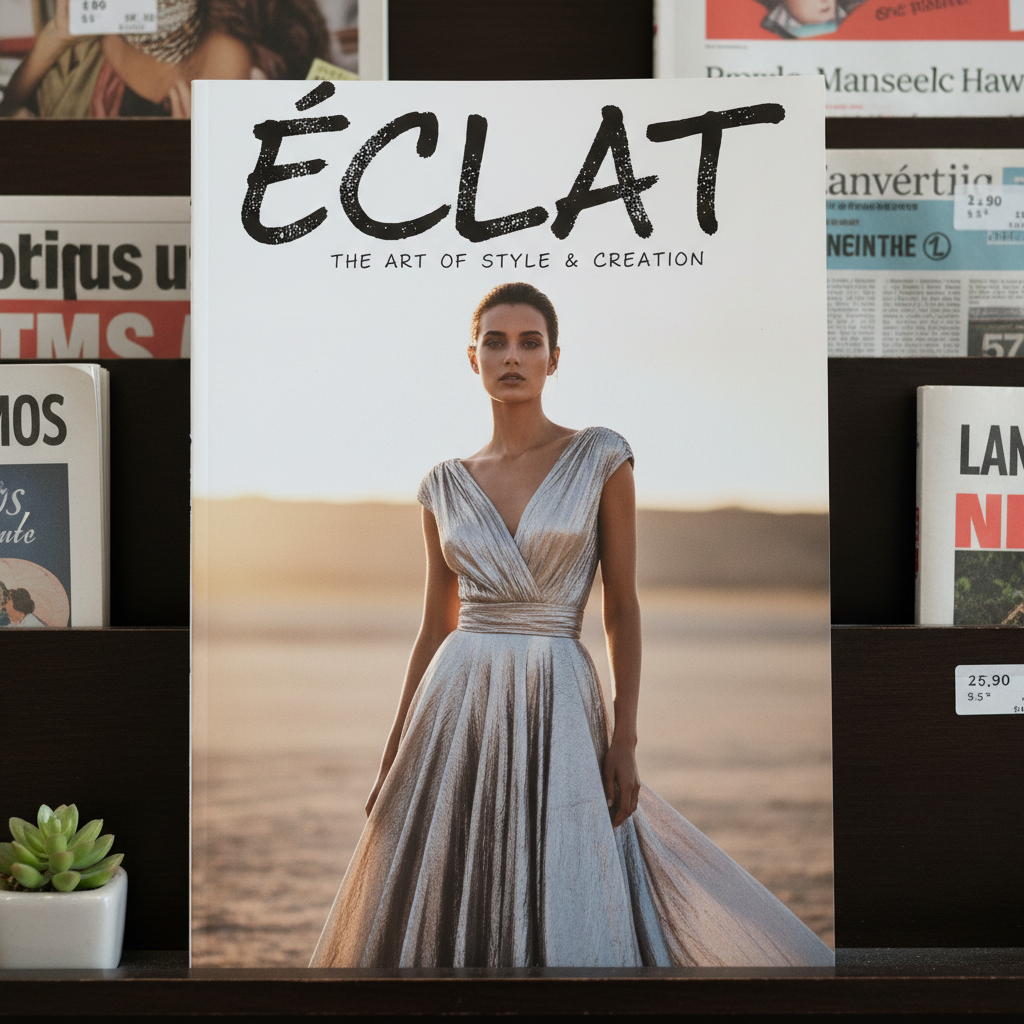
Éclat
Leonardt Copperplate · Carbon ink · 6 revisions · Newsstand-ready
Published
March 2026
Need a masthead that no typeface can give you?
Begin a Commission
Tell me what you
need to feel.
This form is a brief. The more precisely you describe the feeling you want the letters to carry, the more precisely I can answer it.